Well, looks like it’s a season of makeovers going on currently. Oh, I mentioned makeover and you are already thinking of some new style statement for women? Hmmm, I’m, sure most of you must be, but nah I’m not speaking of some new hair coloring trend or new apparel style in vogue…I’m speaking of the latest trend in Indian Marketing Industry – the trend of Indian brand makeovers.
Two weeks ago, I saw the new logo and communication of Godrej, then last week it was Shoppers’ Stop and now it’s CEAT which has gone for a hip & happening colored logo.
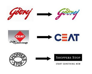
 Honestly speaking I was just shocked to see the 112 year old Godrej logo changed. Having worked in their brand management team earlier, I know how rigid Godrej rules were as far as changing corporate logo was concerned. They strictly wanted to adhere to only traditional color (earlier it was blue then it became red) and despite every new brand manager convincing about a funky logo, the top management never allowed to experiment with it. So, suddenly a bright colored nice looking new logo was a very pleasant sight for my eyes. Here is the official statement of Godrej which states that the re-branding exercise was undertaken as it felt the old brand was not as relevant to young India.(source: moneycontrol.com). As a consumer as well as marketing professional, my take on this – I liked this change J. Estimated money (mentioned in official releases) to be spent by the company in communicating this makeover: Rs. 100 crore!
Now speaking about Shoppers Stop logo change…I am absolutely confused as to why this logo change and what major difference will this new logo design bring to the company? I mean its same black & white color except that it’s rectangular in shape as compared to the earlier elliptical one. Well, from brand perspective I understand that it has been done keeping so called international designs in mind but well, but to a normal consumer I’m sure it must not be looking like any major change as such. And they are spending huge money in communicating this change by advertisements, hoarding etc. Here is the official statement available on agencyfaqs, for this makeover: “Change is essential. Our consumers are changing, their preferences are constantly evolving. They are getting younger. And so, we have to change along with them.” — B S Nagesh, Customer Care Associate & Managing Director, Shoppers’ Stop. “The simple but classic new logo without the old elliptic ring, which has an international look and a timeless appeal, carrying the new baseline ‘Start something new’ prods customers into taking a step ahead to upgrade themselves to the next level in life.(source: indiaretailbiz.com). Well, well doesn’t it look like somehow fitting in a justification for this change? As a consumer as well as marketing professional, my take on this – It looks almost similar to me as in no major change at all as compared to the previous one. Estimated money (mentioned in official releases) to be spent by the company in communicating this makeover: Rs. 20 crore ($5 million)!
And the latest one in race, CEAT logo change? Oh why did they do this? The logo was created in 1958 & this is the first time since then that the company has changed its logo. But do they really needed to change their earlier logo? Here is the official statement for this change: Paras K Chowdhary, chief executive officer, Ceat, says, “The new logo symbolises the strategic transformation at Ceat. It also reflects the fact that though Ceat has a long and proud heritage, the attributes that bring it to life for our customers are as fresh and new as ever. It represents the company’s vision of leading the industry in delivering best in class products, innovations and services to consumers.” (source: agencyfaqs.com). Well, even if they decided to change the logo thinking to bring in some freshness and strategic transformation, they can’t go this wrong in deciding the creative representation of it. I think the earlier logo was very expressive and clear about the message which CEAT wanted to communicate for its tyre brand – born tough. New one just looks like another “me too” logo. As a consumer as well as marketing professional, my take on this – The new logo is NOT good, new font and color are ok, but please bring back that rhino and “born tough” line. No info available on money to be spent on communicating this makeover but year lots of TV ads are airing on prime time television.
Two weeks ago, I saw the new logo and communication of Godrej, then last week it was Shoppers’ Stop and now it’s CEAT which has gone for a hip & happening colored logo.
Now speaking about Shoppers Stop logo change…I am absolutely confused as to why this logo change and what major difference will this new logo design bring to the company? I mean its same black & white color except that it’s rectangular in shape as compared to the earlier elliptical one. Well, from brand perspective I understand that it has been done keeping so called international designs in mind but well, but to a normal consumer I’m sure it must not be looking like any major change as such. And they are spending huge money in communicating this change by advertisements, hoarding etc. Here is the official statement available on agencyfaqs, for this makeover: “Change is essential. Our consumers are changing, their preferences are constantly evolving. They are getting younger. And so, we have to change along with them.” — B S Nagesh, Customer Care Associate & Managing Director, Shoppers’ Stop. “The simple but classic new logo without the old elliptic ring, which has an international look and a timeless appeal, carrying the new baseline ‘Start something new’ prods customers into taking a step ahead to upgrade themselves to the next level in life.(source: indiaretailbiz.com). Well, well doesn’t it look like somehow fitting in a justification for this change? As a consumer as well as marketing professional, my take on this – It looks almost similar to me as in no major change at all as compared to the previous one. Estimated money (mentioned in official releases) to be spent by the company in communicating this makeover: Rs. 20 crore ($5 million)!
And the latest one in race, CEAT logo change? Oh why did they do this? The logo was created in 1958 & this is the first time since then that the company has changed its logo. But do they really needed to change their earlier logo? Here is the official statement for this change: Paras K Chowdhary, chief executive officer, Ceat, says, “The new logo symbolises the strategic transformation at Ceat. It also reflects the fact that though Ceat has a long and proud heritage, the attributes that bring it to life for our customers are as fresh and new as ever. It represents the company’s vision of leading the industry in delivering best in class products, innovations and services to consumers.” (source: agencyfaqs.com). Well, even if they decided to change the logo thinking to bring in some freshness and strategic transformation, they can’t go this wrong in deciding the creative representation of it. I think the earlier logo was very expressive and clear about the message which CEAT wanted to communicate for its tyre brand – born tough. New one just looks like another “me too” logo. As a consumer as well as marketing professional, my take on this – The new logo is NOT good, new font and color are ok, but please bring back that rhino and “born tough” line. No info available on money to be spent on communicating this makeover but year lots of TV ads are airing on prime time television.


